
In this age of digital downloading, I believe that the disconnect between music and packaging is becoming even greater than when die-hard vinyl purists decried the reduced real estate of a CD jacket. At least CD packaging allowed for some art, some sort of visual to go along with the audio. For me, the packaging is a huge part of the whole presentation of an album.
Here are the covers of five of my all-time favorite records. See if you notice anything similar about them:


Crescent EP
Unwound New Plastic Ideas
Six Finger Satellite - Severe Exposure
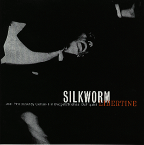
Silkworm - Libertine
Boxhead Ensemble - Dutch Harbor: Where The Sea Breaks Its Back
Something hit me recently. The covers to at least five of the records that I've listened to hundreds and hundreds of times are all black & white. Save for a little yellow here, a bit of red there, and Severe Exposure's black-on-silver motif, they're black & white. (My personal copy of Severe Exposure is an advance release version with - you guessed it - a black & white cover).
I love the music on these albums dearly. I love how they sound, and how they were recorded (which would probably be considered 'dirty' or 'lo-fi' by a lot of engineers). The music on these records is largely dissimilar - Crescent is all drones and unintelligble vocals. Unwound (on this record at least) trades in abrasive post-punk and full-on stoner jams. I refer to 6FS as "cocaine rock", all ugly 80s synths and sleaze. Silkworm's Libertine (which was recorded by Steve Albini) sounds massive and airy, whilst being angular and jagged in spots, and achingly pretty in others. And the Boxhead Ensemble record is the mostly improvised and entirely haunting soundtrack to Braden King's eponymous documentary, which deals with life in the fishing community of Dutch Harbor, AK (a bleak place by most accounts).
I realized that these records sound like they're in black & white to me. Not to say that they sound monochromatic. It's more of a noir feel. Despite the differences in the music, there seems to be a common thread throughout. Possibly it's the way the guitars sound, or the sense of melancholy, and the preponderance of minor key tonality.
There are typographic and graphic similarities as well - what I've always thought of as a "1960s encyclopedia" look, for lack of a better description. The cover art for these albums have been nearly as big an influence on me as the music contained therein.
We're moving back into a singles-driven market. In the olde days, 45s usually came in paper sleeves with the record company's logo on it. There were no pictures of the band, no information about the players anywhere. Then the LP came along, and the listener obtained a new way to connect with the people who made the music they loved. This is going by the wayside again. Of all of the mp3s I've downloaded off the internet, I know so little about so many of the bands. I don't know what they look like, or who the band members are, or where they recorded the music, who produced it, even what label it came out on. These things may not be important to a lot of music listeners, but for me, it helps create a richer, and more important experience.
1 comment:
Let's not forget some other B/W or quasi B/W gems:
Lou Reed - Transformer
The high contrast in this photo is perfect, it totally is like a mirror for Lou in the heady heroin days.
Beck - One Foot In The Grave
Still my favorite Beck record. Him and James from Red Stars Theory both look so, oh I dunno, "Olympia".
Satisfact - S/T LP
Not B/W, but beautifully monochromatic. The image grain almost reminds me of a VHS still frame.
Post a Comment